Final Fantasy XIV Website Redesign
Final Fantasy XIV (FFXIV) is an acclaimed Mass Multiplayer Online Role Playing Game (MMORPG). It features a world to explore, fight, craft and socialise, to name a few. The current website for FFXIV has many issues, from bad navigation design to an overwhelming amount of information, much of it is seemingly unimportant to new users. Therefore, I decided to use this as a basis for a redesign project, with a focus on service design methodologies.
How to redesign?
The intent of this project was to re-focus on the initial touchpoint a new user would have with the product (FFXIV). Additionally, I wanted to employ various methods to spotlight new features for potential advertisements. The current generic “fantasy” landing page is a collage of mismatched fonts and identities, along with multiple button variations and meagre artistic direction.

The redesign had a lot of work cut out for it. With the user as a North Star, I went ahead to elevate the experience, streamline navigation and especially enhance the visual aesthetics. It was important to make it less overwhelming but still exude style. Modernisation was also a key feature as a lot of the old design felt incredibly dated.
The plan was as such:
Primary and secondary research
Scenario creation
User journey mapping
Moodboarding
Wireframing
Application of the above to the website and brand re-design
This process is necessary to form the basis of human-centred design. The redesign benefitted greatly from the steps taken versus methods such as A/B testing. By focusing on content which users truly valued, it uncovered opportunity areas previously left unexplored.
Scenarios
Before a scenario can be created, a persona which will explore the scenario is necessary. For that, extensive interviews with the target audience were taken and their answers plotted. It was important to also understand the emotional state as this wasn’t just a marketing persona, but a “proto-persona”. This would allow for a much more holistic view of the user, not just strict demographics but goals, ambitions and frustrations.

The first step after the interviews was to synthesise the data. This meant finding common variables across the interviews and mapping them using analysed factors and plotting them on axes, charts and groups.
The most interesting factor to mention from the variable map is the “Reason to Play”. By using Bartles Taxonomy, I found the underlying motivations of why my interviewees played games. The chart was developed in the 1990s by Richard Bartle to find a singular expression for why people played online games. The most popular motivation was to socialise with friends and strangers online which makes them Socialisers. The second most common reason is split between Explorers and Achievers. Explorers love to explore not just the game world, but systems within it and find new and interesting solutions. Achievers play to be the best, such as to dominate the in-game market economy or slay the strongest enemies. Finally, we have the Killers, which none of my interviewees identified with. They are the type of players whose sole enjoyment comes from killing other players and deriving pleasure from others misery.
This framework gave me a clear way to map motivations which was one of the most important conditions I wanted to fulfil with the interview stage as it would give the redesign a clear “motif” to build upon.
After the variable mapping and before creating the primary persona, I took an in-between step of creating a persona moodboard.

The moodboard let me target some points that weren’t yet concrete, such as finer details on the demographic, as well as interests, aesthetics, and “feel”. The “feel” is the atmosphere I wanted to create with the persona by using colours, activities, furniture, etc. It also helps to convey the emotional and experiential aspects of my persona.
There were two main uses for my persona: to help empathise with the end user, as well as find a reference point to direct the creation of the User Journey Map and the What If Scenarios. The persona also helps me contextualise any future choices as it refocuses on the needs of the users.

The conclusion from this method was the resolution. It shows the need for 2 types of in-game activities. The first is “infinitely” replayable, alone or with friends. The second is a type of long-form content which creates a sense of progression, for solo or co-op play.
The identification of these much-needed activities creates opportunities for future development of the game and advertising. The advertising is of note as it is one of the first touch points a potential user might have with the game, and demonstrates the various ways they can engage with FFXIV to garner high interest.
User Journey Mapping
This method allows to find opportunities within the process of the user finding or using the product. In this case the product is not the game but the touchpoints with the game. Hence, I set out to find opportunities in the process of convincing new users to try the game and where potential agitations could be alleviated.

There are 9 levels to this user journey map (Figure 4.1). These levels, from top to bottom, are:
Stages: These are the broad steps the persona would take in the process of finding FFXIV and playing it. These help categorise and contextualise the levels below it.
Steps: These are more specific than Stages. This helps map out more precisely the actions taken by the persona. It breaks down the stage into smaller pieces which lets me examine them more closely.
Photos: Although an optional stage in many Journey Maps, it helps sympathise and gives a really good visual aid to the steps.
Emotions: These help display the mental space the persona is in during each step of the process. It helps to understand which steps might be the most distressing/confusing/negatively associated.
Channels: In many other types of services, there might have been multiple channels along the way. However, due to the nature of FFXIV being a game, it is only available on 2 platforms: its own website and Steam (The world's largest digital games storefront). The channels become incredibly streamlined after initial contact with the game's touchpoint (ad, recommendation from friend, etc).
Questions: This is the first level where opportunities are found. The levels above help comprehend the situation and sympathise with the persona. The questions level starts to unravel the potential problem spaces and solutions by imagining all the questions the persona might have in each state. For example, the persona might be confused at what type of a game an MMORPG is and what type of gameplay it offers. This opens a solution space in which I can develop ways to educate newcomers to what the genre is.
Pains: This level takes questions and digs deeper to find what the pains behind the questions could be, or even what pains asking the questions could lead to. For example, trying to learn about what an MMORPG is could lead to frustrations as there may not be an easy to understand the information available. This can lead to confusion which can easily grow into frustration. This is potentially huge friction created in just the first step of trying to understand the game.
What if?: Not to be confused with What If scenarios where the What If can be impossible solutions which are then investigated, What Ifs here ask what could go wrong and help find any recovery systems which could be needed.
Opportunities: With all the work in the levels above, finding the opportunity spaces and the information which would be valuable to the persona becomes much easier. This is the first rough idea of what might be worth pursuing. It likewise helps develop new features to make the game better.
The process of creating a User Journey Map, with the persona as the anchor, enhances the design of the services and finds weak spots previously unseen. There’s a clear reason for each level and as the pain points are identified, they synthesise to create opportunities.
Redesign
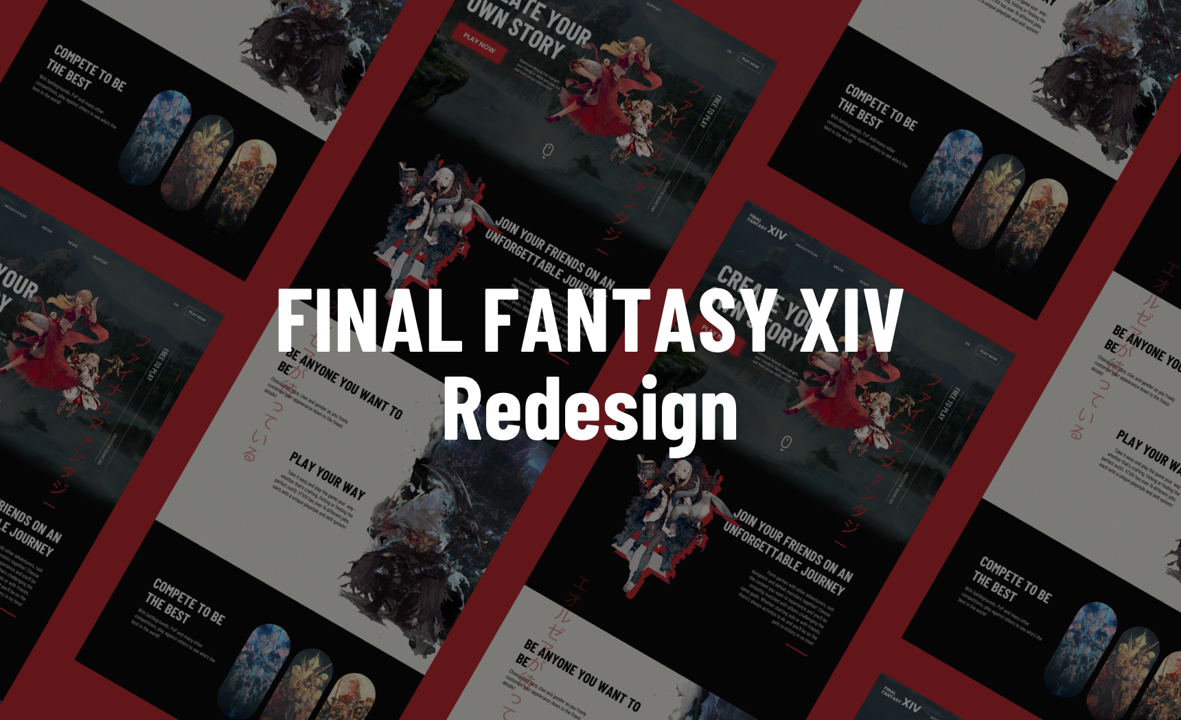
As the main types of players I wanted to attract with the redesign were Socializers, the focus lies in showing off the multiplayer features and group activities. However, this was the content. In terms of design, I took a much cleaner approach than the current design.
A point of repetition in my interviews and accordingly a frustration in the Primary Persona was the feeling of being overwhelmed. There was a lot of visual clutter on the current website, leading to the same feeling of too much information with previously stated: clashing colours, fonts and many attention-grabbing elements. The first step was to fix these issues, as well as modernise a lot of legacy elements from the game's long history.

The most striking difference between the old website and the new one is the font choice and layout. Gone is the serif logo, replaced with a much simpler san serif logo tucked in the upper left corner. A whole new navigation system was created. Instead of having all the content on a single, long webpage, the content is now separated into several different pages. The new subtitle text mentions the multiplayer aspect while the main title refers to player autonomy, a cornerstone of FFXIV.
I refocused the rest of the website redesign to cover the Self-Determination Theory in order of importance which was previously tested during the advertising poster exercise:
Relatedness: This refers to people finding a sense of belonging and connection with others.
Autonomy: People need to feel they have a choice and therefore control over themselves and their environment.
Competence: This would refer to the achievements and mastery people seek from their lives, be it professional or personal.

A striking feature is the Japanese lettering found across it. I wanted to maintain the rich history and roots of Final Fantasy and its development in Japan.
The sections, in order, refer back to the Relatedness, Autonomy and Competence mentioned above. Overall, it’s majorly simplified by having common branding across the whole page. The contrasting red colour, the san serif font and the official concept art from the game further accentuate the modern branding.